
Immersive Palettes: Color Theory in the Realm of Virtual Reality
Chosen theme: Color Theory in the Realm of Virtual Reality. Step inside a world where hue, light, and perception reshape how we feel, navigate, and remember digital spaces. Join the conversation, subscribe for experiments, and share your color triumphs.

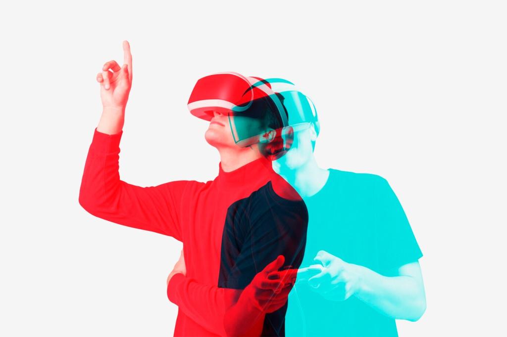
Why Color Works Differently in VR

VR displays emit additive RGB light filtered through lenses that warp, magnify, and vignette. This optical chain subtly shifts hues and perceived contrast, so palettes tuned for monitors often feel overly saturated or muddy once inside a headset.
Emotional Palettes for Presence and Mood
A meditation prototype used desaturated blues and gentle cyan fog to soften edges and lower arousal. Testers reported slower breathing within minutes. The key was restraint: low chroma, stable luminance, and subtle gradients that never competed with ambient sound.
For an action arena, a cool steel-blue environment stabilized perception, while small, high-chroma orange highlights signaled interactive hotspots. Because contrast was localized, players chased orange pulses instinctively, reporting faster orientation and fewer missed objectives during early trials.
Color meanings travel with culture. Red can imply danger, celebration, or luck. In global releases, pair hue with shape and motion cues. Invite your community to vote on regional variants to preserve clarity while honoring cultural expectations.
Comfort, Accessibility, and Visual Health
Contrast That Aids, Not Overwhelms
High contrast improves legibility, but excessive luminance jumps cause fatigue in enclosed displays. Favor 4.5:1 or better for text, cap pure white usage, and use mid-tones for large surfaces. Provide a night mode with warmer whites and softened highlights.
Color-Blind Friendly Palettes in 3D
Deuteranopia and protanopia can collapse reds and greens. Differentiate with luminance steps, patterns, and motion, not hue alone. In tests, shifting reds toward magenta and leveraging distinct material roughness helped players quickly sort collectible items without confusion.
Hue, Motion, and Cybersickness
Saturated patterns near the periphery can amplify discomfort during locomotion. Reserve strong chroma for focal objects, keep peripheral palettes calmer, and avoid strobing contrasts. Encourage users to toggle vignette strength and saturation to tune comfort in real time.
Lighting Pipelines, HDR, and Tone Mapping
ACES can preserve highlights beautifully, but it may push skin toward ruddy tones if not balanced. Test neutral gray scenes and flesh references, then adjust exposure and white balance. Lock decisions into a reproducible setup for every build.
Lighting Pipelines, HDR, and Tone Mapping
Fog and volumetric light blend color across depth, shaping mood and readability. A slight warm scatter through god rays can suggest late afternoon, while cool mist communicates distance. Profile cost carefully, but treat atmosphere as a color instrument, not garnish.


Depth-Aware Legibility
UI cards placed at 1.5–3 meters reduce vergence strain. Use moderate background translucency with carefully chosen backdrop blur to stabilize contrast. Select chroma that remains readable over dynamic environments, and offer a quick toggle for high-contrast assist.
Guiding Attention with Color Hierarchy
Reserve your brightest accent for primary actions, a softer accent for secondary, and neutral chroma for bodies. This hierarchy reduces cognitive load. In playtests, players completed tasks faster when accent roles never drifted across menus and diegetic elements.
Foveation and Peripheral Signaling
Foveated rendering blurs the periphery slightly. Avoid relying on subtle hue changes outside the focal region. For alerts, combine modest chroma with brief bloom or motion cues so notifications register without harsh flashes that fatigue sensitive users.
Narrative Color Scripts in Immersive Worlds
Establishing the Home Palette
Anchor the opening with familiar mid-chroma hues—soft ambers, muted teals—so later shifts feel meaningful. When tension rises, narrow the palette and push contrast slowly, letting the audience sense change before they consciously notice it.
Turning Points Through Controlled Chroma
At pivotal moments, a single new hue can feel like a plot twist. Introduce a saturated accent tied to story stakes, then weave it into lighting and props. Players reported strong recall when the hue reappeared as a subtle foreshadow.
Resolution and Color Release
As conflict resolves, relax contrast and reintroduce breadth in hue. A gentle warm shift in skylight or a cooler, cleaner white in interfaces signals clarity. Encourage players to reflect by fading accents into supportive, calmer tones during epilogues.
Include headset cross-checks, reference scenes, skin tones, and UI contrast audits. Test at multiple brightness settings and compare screenshots against calibrated monitors. Log deltas and standardize screenshots to catch regressions early across teams.
Testing, Metrics, and Iteration for Color
Track dwell time near interactive colors, click-through on highlighted elements, and comfort toggles used. Overlay heatmaps with palette zones to see whether accents guide or distract. Share anonymized findings to gather broader community interpretation.
Testing, Metrics, and Iteration for Color